Hello, This is my first website and I want some feedback from you guys. It’s very basic and I haven’t added much. just wanted to host something so I threw invidious and whoogle instance there. My ISP doesn’t provide a static IP so I had to host it on tor :( what else do you think I should host there? server spec: 15 year old computer with i3 first gen cpu.
Edit: Here is the URL if you want to visit the website: ot6ewcgzioleglf2jp2iofludol3hw5gcaycaj7n5tolf6wcu7ofbzid.onion
It’s beautiful. Plus FOSS services let’s go!
For the IP issue: You can look into some service which automatically updates your domains DNS. It’s been a while but back then one of those was DynDNS, not sure if they still exist, but others surely do.
I forgot to mention that I am also behind CGNAT. I bought a VPS for a while but couldn’t keep with the cost. Right now the cheapest way of hosting a website for me is through tor.
Plain old static HTML is fine, and you can host it on a potato! Here are some design tips to keep it easy to read. None of them are objectively correct, and you are already doing some of them. They are just some suggestions as you move forward:
- Don’t use dark-on-dark fonts. Use near-black on off-white or at least something high contrast.
- Break up content using horizontal rules <hr> and various headers <h1 to h6> You can style both of them in css. This keeps things easy to find and read.
- Generally, do not center-align text if it is more than one line. If you need to display blocks of text side-by-side, put each in a container then left-align the text within those containers.
- Use a bigger font than you think is strictly necessary.
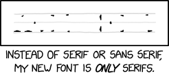
- My preference is to use sans-serif fonts. Google makes some good free ones. Sometimes I’ll go back and make titles serif only.
- Resize and compress your images. A bit higher resolution than you need but with lower quality is usually better than the reverse (for jpegs)
make titles serif only
I don’t want to question your aesthetic choices but I think it hurts readability.

Surprisingly, I can’t find that made as an actual usable font. I would have thought someone in font design would jump at the chance just for the fun of it.


