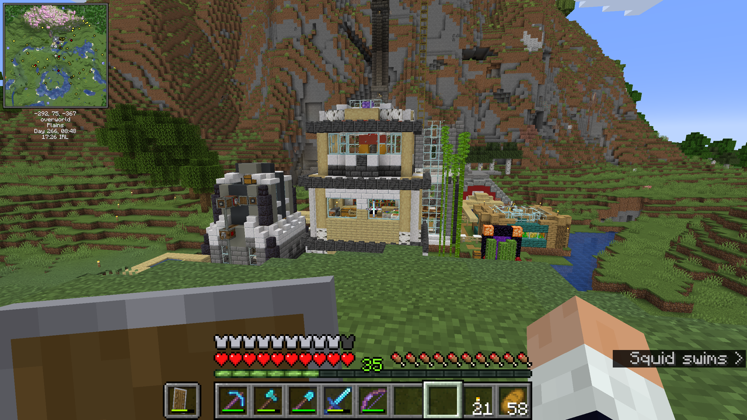
I don’t want to visit reddit, so I came here; Yet this community seems so small. I wanna ask how to build something that is not ugly mess, is it fine to ask it here? Would the Minecraft Forum be a better place for this?

EDIT: Added the screenshots of my atrocious buildings.
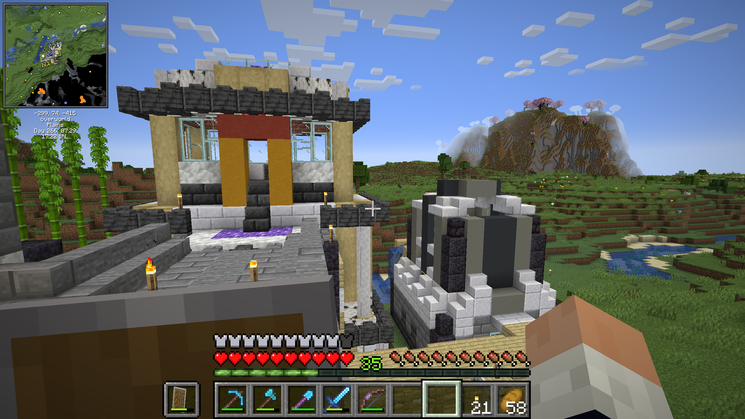
Absolute atrocities Back of atrocity

  • Lvxferre@mander.xyz
    link
    fedilink
    English
    arrow-up
    8
    ·
    6 months ago

    It is not so bad that it’s an “ugly mess”. It’s simply cluttered. The shape looks good even if a bit weird, the issue are your choices of blocks, they’re clashing with each other, and you’re using a lot of different types so it’s really hard to combo them.

    I’d suggest you to make a creative mode copy of your world and try the following, see if you like the results:

    • Replace those birch logs with spruce, so they contrast better with the birch planks. Either keep them all with their bark, or remove it from all of them. If you feel that the build becomes too colourless, barkless acacia logs are also an option.
    • Replace the yellow and red concrete with the same type of log that you picked above.
    • Pick one between basalt, plain stone, or that white stone (I think that it’s modded marble?). The mix is fine in the right building because it’s just stone, but when you’re combining it with other elements it’s making it look too busy.
    • I’m not too hot on the usage of concrete + bricks like you did in the right. Perhaps it would be better to stick to one or another.
    • That amethyst doormat needs to go. It makes your sight gravitate towards the floor.
    • Consider replacing those torches in the building with lanterns, hanging from the roof. The ones nearer to you are a bit trickier, I’d probably try to replace them with froglight or shroomlights.
    • someacnt_@lemmy.worldOP
      link
      fedilink
      English
      arrow-up
      3
      ·
      6 months ago

      I see, I was trying to be too clever with the build. Let me reduce the number of selections being used in the build.

      • Lvxferre@mander.xyz
        link
        fedilink
        English
        arrow-up
        2
        ·
        6 months ago

        Sometimes less is more. (And sometimes more is more. It… depends, really.)

        I like the shape, though. A lot of people struggle giving their buildings depth, but you did it rather well.